Rebranding Compassion
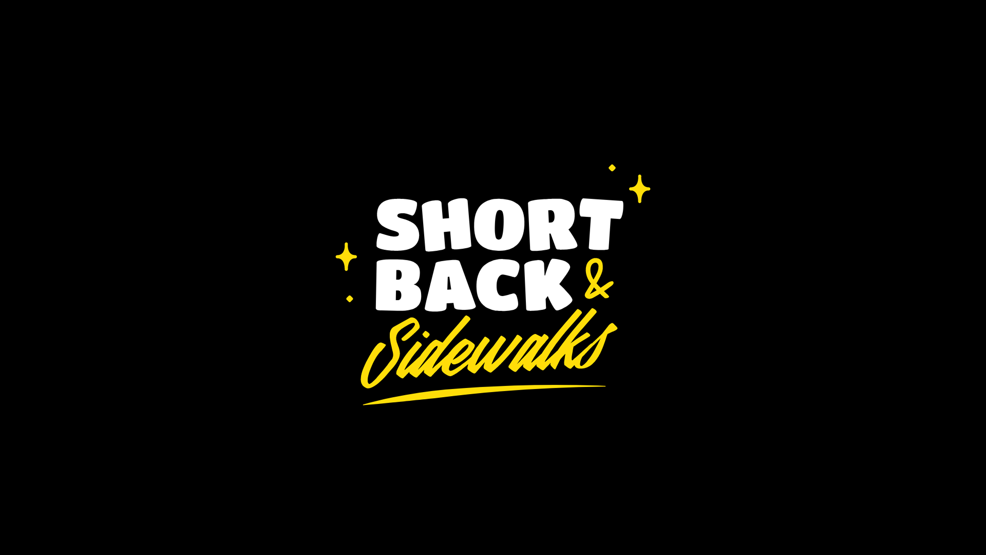
Brand Refresh for Short Back & Sidewalks
In early 2020, I was approached to rebrand Short Back & Sidewalks, one of Perth's most recognised not-for-profit organisations.
The organisation provides free haircuts to people experiencing homelessness and hardship, creating moments of dignity, confidence and human connection through a simple act of care.
The brief was to inject fresh life into the brand while helping the organisation build stronger recognition and emotional connection within the community.
The Challenge
Not-for-profits often face a delicate balancing act.
On one hand, they need to be trusted and professional. On the other, they need to feel approachable, human and relatable to the people they support.
For Short Back & Sidewalks, the challenge was to create a brand that:
- Felt welcoming and inclusive.
- Reduced the stigma that can sometimes prevent people from seeking support.
- Built stronger recognition and equity within the not-for-profit sector.
- Encouraged community participation, volunteering and donations.
- Reflected the warmth and humanity of the organisation itself.
Importantly, I wanted to create a brand that didn't feel overly polished or corporate. The people behind the organisation are genuine, grassroots and community-focused, and the identity needed to embody those qualities.
The Creative Approach
The new brand identity was intentionally designed to feel:
- Fun and vibrant.
- Friendly and approachable.
- Slightly imperfect and handcrafted.
- Human and full of personality.
The visual system embraced a rough-around-the-edges aesthetic, helping the organisation stand apart from more traditional charity brands and creating a sense of authenticity that felt true to its mission.
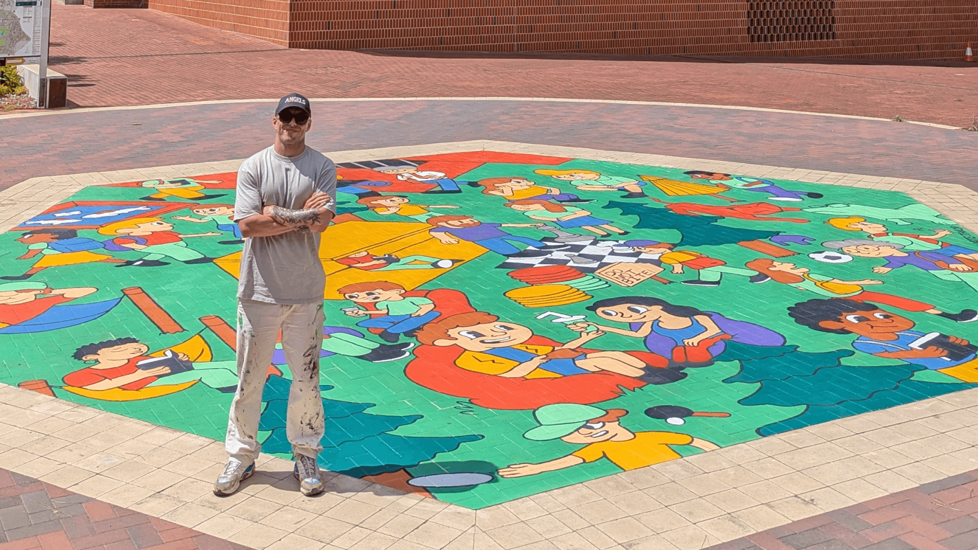
Building a Brand with Character
One of the most enjoyable aspects of the project was developing a series of custom illustrated characters that became a central part of the identity.
These characters were designed to:
- Bring warmth and personality to the brand.
- Humanise communications and storytelling.
- Create a recognisable visual language across collateral.
- Foster a sense of community among supporters and volunteers.
The illustrations were particularly effective when applied to merchandise, including t-shirts that volunteers and supporters could proudly wear, helping to turn the brand into a visible symbol of community and kindness.
Beyond the Identity
As part of the rebrand, I also recommended the implementation of a regular newsletter strategy.
The goal was to create an ongoing channel that would:
- Keep donors and supporters informed about the organisation's activities.
- Celebrate the stories of volunteers and community members.
- Strengthen engagement with existing supporters.
- Encourage a more sustainable and consistent donation cycle.
By combining storytelling with regular communication, the organisation could continue building meaningful relationships with its community long after an individual donation had been made.
The Outcome
The rebrand helped reposition Short Back & Sidewalks as an approachable, vibrant and distinctly human organisation.
Through illustration, personality and strategic thinking, the new identity created a stronger emotional connection with both the people the organisation serves and the wider community that supports its mission.
Services
- Brand Strategy
- Brand Identity Design
- Illustration
- Character Design
- Merchandise Design
- Communications Strategy
- Newsletter Strategy
Client
Short Back & Sidewalks
Result
A vibrant and approachable rebrand that strengthened the organisation's presence within the not-for-profit sector, reduced barriers to engagement and created a distinctive visual identity that volunteers and supporters could proudly rally behind.